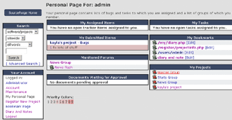

SourceForge Before
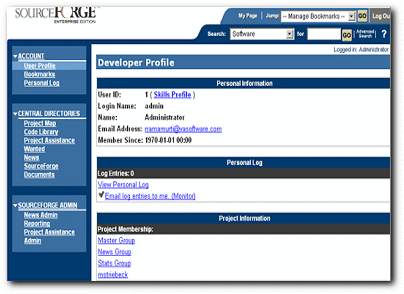
 SourceForge After
Key Challenges
- SourceForge was originally designed for the open source community as a web site that generated revenue through ad dollars. The application had accreted over time in a haphazard manner. It had not been productized for the enterprise.
- The application did not look like a professional product.
- Navigation was inconsistent and shifting. Users could not find or re-find the sub-applications that they needed.
- The application stored vast amounts of information and didn't give users sufficient information about the importance of any given piece of information.
- Information hierarchy was inconsistently indicated by different font sizes and locations.
- Nomenclature was inconsistent.
Key Accomplishments
- Overhauled the information architecture to provide consistency in nomenclature, information hierarchy, and to provide clear indicators of where users where located in the system. Added breadcrumbs where appropriate.
- Designed a user-configurable alert-based system to let users know when information might be important to them.
- Designed new ways to navigate the information space to help users get the information they needed.
- Designed role-based access control to allow organizations to fine-tune who can view and change information.